潘忠显 / 2021-04-17
“JavaScript 工作原理”系列文章是翻译和整理自 SessionStack 网站的 How JavaScript works。因为博文发表于2017年,部分技术或信息可能已经过时。本文英文原文链接,作者 Alexander Zlatkov,翻译 潘忠显。
How JavaScript works: the internals of Shadow DOM + how to build self-contained components
Jun 21, 2018 · 11 min read

This is post # 17 of the series dedicated to exploring JavaScript and its building components. In the process of identifying and describing the core elements, we also share some rules of thumb we use when building SessionStack, a JavaScript application that needs to be robust and highly-performant to help users see and reproduce their web app defects real-time.
If you missed the previous chapters, you can find them here:
- An overview of the engine, the runtime, and the call stack
- Inside Google’s V8 engine + 5 tips on how to write optimized code
- Memory management + how to handle 4 common memory leaks
- The event loop and the rise of Async programming + 5 ways to better coding with async/await
- Deep dive into WebSockets and HTTP/2 with SSE + how to pick the right path
- A comparison with WebAssembly + why in certain cases it’s better to use it over JavaScript
- The building blocks of Web Workers + 5 cases when you should use them
- Service Workers, their life-cycle, and use cases
- The mechanics of Web Push Notifications
- Tracking changes in the DOM using MutationObserver
- The rendering engine and tips to optimize its performance
- Inside the Networking Layer + How to Optimize Its Performance and Security
- Under the hood of CSS and JS animations + how to optimize their performance
- Parsing, Abstract Syntax Trees (ASTs) + 5 tips on how to minimize parse time
- The internals of classes and inheritance + transpiling in Babel and TypeScript
- Storage engines + how to choose the proper storage API
Overview
Web Components is a suite of different technologies that allows you to create reusable custom elements.Their functionality is encapsulated away from the rest of your code, and you can utilize them in your web apps.
There are 4 Web Component standards:
- Shadow DOM
- HTML Templates
- Custom elements
- HTML Imports
In this article, we’ll focus on the Shadow DOM.
Shadow DOM is designed as a tool for building component-based apps. It offers solutions to common problems in web development you’ve probably experienced:
- Isolated DOM: A component’s DOM is self-contained (e.g.
document.querySelector()won’t return nodes in the component’s shadow DOM). This also simplifies the CSS selectors across your web app since DOM components are isolated, and it gives you the ability to use more generic id/class names without worrying about naming conflicts. - Scoped CSS: CSS defined inside shadow DOM is scoped to it. Style rules don’t leak out and page styles don’t interfere with it.
- Composition: Design a declarative, markup-based API for your component.
Shadow DOM
This article assumes that you’re already familiar with the concept of the DOM and its APIs. If not, you can read a detailed article about it here — https://developer.mozilla.org/en-US/docs/Web/API/Document_Object_Model/Introduction.
Shadow DOM is just a normal DOM except for two differences:
- How it’s created/used in relation to the rest of the page compared to the wah you create and use DOM
- How it behaves in relation to the rest of the page
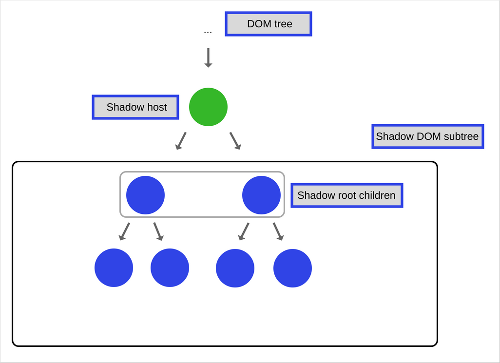
In general, you create DOM nodes and append them as children to another element. In the case of shadow DOM, you create a scoped DOM tree that’s attached to the element yet it’s separate from its actual children. This scoped subtree is called a shadow tree. The element it’s attached to is its shadow host. Anything you add to the shadow tree becomes local to the hosting element, including <style>. This is how shadow DOM achieves CSS style scoping.
Creating Shadow DOM
A shadow root is a document fragment that gets attached to a “host” element. The moment you attach a shadow root is when the element gains its shadow DOM. To create shadow DOM for an element, call element.attachShadow():
var header = document.createElement('header');
var shadowRoot = header.attachShadow({mode: 'open'});
var paragraphElement = document.createElement('p');

paragraphElement.innerText = 'Shadow DOM';
shadowRoot.appendChild(paragraphElement);
The specification defines a list of elements that can’t host a shadow tree.
Composition in Shadow DOM
Composition is one the most important features of Shadow DOM.
When writing HTML, composition is the way you construct your web app. You combine and nest different building blocks (elements) such as <div>, <header>, <form> and others in order to build the UI you need for your web app. Some of these tags even work with each other.
Composition defines why elements such as <select>, <form>, <video> and others are flexible and accept specific HTML elements as children in order to do something special with them.
For example, <select> knows how to render <option> elements into a dropdown widget with pre-defined items.
Shadow DOM introduces the following features which can be used to achieve composition.
Light DOM
This is the markup a user of your component writes. This DOM lives outside the component’s shadow DOM. It is the element’s actual children. Imagine that you’ve created a custom component called <better-button> which extends the native HTML button and you want to add an image and some text inside it. This is how it looks like:
The “extended-button” is the custom component that you have defined, while the HTML inside it is called Light DOM and is added by the user of your component.
The Shadow DOM here is the component you have created (“extended-button”). Shadow DOM is local to the component and defines its internal structure, scoped CSS, and encapsulates your implementation details.
Flattened DOM tree
The result of the browser distributing the light DOM, that’s been created by the user into your shadow DOM and which has defined your custom component, renders the final product. The flattened tree is what you ultimately see in the DevTools and what’s rendered on the page.
Templates
When you have to repeatedly reuse the same markup structures on a web page, it’s better to use some kind of a template rather than repeat the same structure over and over again. This was possible before, but it is made a lot easier by the HTML element (which is well-supported in modern browsers). This element and its contents are not rendered in the DOM but it can still be referenced using JavaScript.
Let’s look at a quick trivial example:
This won’t appear in your page until you reference it with JavaScript, and then append it to the DOM using something like the following:
var template = document.getElementById('my-paragraph');
var templateContent = template.content;
document.body.appendChild(templateContent);
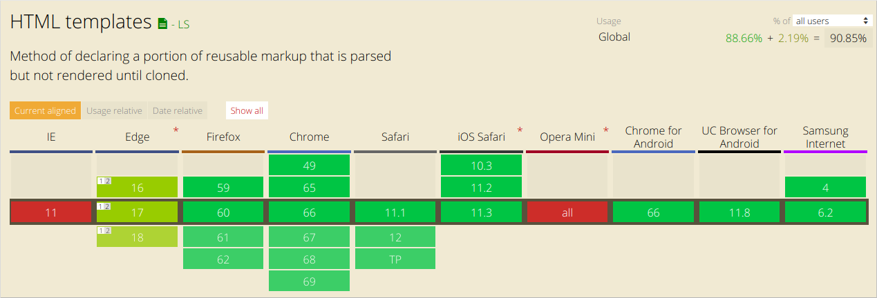
Until now there have been other techniques to achieve similar behavior but, as mentioned earlier, it’s quite nice to have this covered natively. It also has pretty decent browser support:

Templates are useful on their own but they work even better with custom elements. We’ll define custom elements in another post of the series, for the time being you should know that the customElement API in the browser allows you to define your own tags with custom rendering.
Let’s define a web component that uses our template as the content of its shadow DOM. We’ll call it <my-paragraph>:
customElements.define('my-paragraph',
 class extends HTMLElement {
   constructor() {
     super();

     let template = document.getElementById('my-paragraph');
     let templateContent = template.content;
     const shadowRoot = this.attachShadow({mode: 'open'}).appendChild(templateContent.cloneNode(true));
  }
});
The key point to note here is that we appended a clone of the template content to the shadow root, that’s been created using the Node.cloneNode() method.
And because we are appending its contents to a shadow DOM, we can include some styling information inside the template in a <style> element, which is then encapsulated inside the custom element. This wouldn’t work if we just appended it to the standard DOM.
For example, we can change our template to the following:
Now the custom component we have defined with our template can be used like this:
<my-paragraph></my-paragraph>
Slots
Templates have a few downsides, the main one being the static content which doesn’t allow us to render our variables/data in order to make it work the way standard HTML templates you’re used to do.
This is where the <slot> comes into the picture.
You can think of slots as placeholders that allow you to put your own HTML in the template. This allows you to create generic HTML templates and then make them customizable by adding slots.
Let’s see how the above template will look like with a slot:
If the slot’s content isn’t defined when the element is included in the markup, or if the browser doesn’t support slots, <my-paragraph> will just contain the fallback content “Default text”.
To define the slot’s content, we should include an HTML structure inside the <my-paragraph> element with a slot attribute whose value is equal to the name of the slot we want it to fill.
As before, this can be anything you like:
Elements that can be inserted into slots are known as Slotable; when an element has been inserted into a slot, it is said to be slotted.
Note that in the above example we have inserted a <span> element which is the slotted element. It has an attribute slot that’s equal to “my-text” which is the same as the value of the name attribute in the template’s slot definition.
After being rendered in the browser, the above code will create the following Flattened DOM tree:
Note the #shadow-root element — it’s just an indicator that Shadow DOM exists.
Styling
A component that uses shadow DOM can be styled by the main page, can define its own styles, or provide hooks in the form of CSS custom properties for users to override defaults.
Component-defined styles
Scoped CSS is one of the greatest features of Shadow DOM:
- CSS selectors from the outer page don’t apply inside your component.
- Styles defined inside your component don’t impact the rest of the page. They’re scoped to the host element.
CSS selectors used inside Shadow DOM apply locally to the component. In practice, this means we can use common id/class names again, without worrying about conflicts elsewhere on the page. Simple CSS selectors mean better performance.
Let’s take a look at the following #shadow-root that defines some styles:
All the styles in the above example are local for the #shadow-root.
You can also use the element to include stylesheets in the #shadow-root which are also local.
The :host pseudo-class
The :host allows you to select and style the element hosting a shadow tree:
There’s one thing you should be careful with when it comes to :host — rules in the parent page have higher priority than :host rules defined in the element. This allows users to override your top-level styling from the outside. Also, :host only works in the context of a shadow root, so you can’t use it outside of a Shadow DOM.
The functional form of :host(<selector>) allows you to target the host if it matches a <selector>. This is a great way for your component to encapsulate behavior that reacts to user interaction or state, and style internal nodes based on the host:
Theming and element with the :host-context() pseudo-class
The :host-context(<selector>) pseudo class matches the host element if the latter or any of its ancestors matches <selector>.
A common use for this is theming. For example, many people do theming by applying a class to <html> or <body>:
:host-context(.lightheme) would style <fancy-tabs> when it’s a descendant of .lightheme:
:host-context() can be useful for theming but an even better approach is to create style hooks using CSS custom properties.
Styling the host element of a component from the outside
You can style the host element of components from the outside by just using their tag name as selector like this:
Outside styles have higher priority than styles defined in Shadow DOM.
For example, if the user writes the selector:
, it will overwrite the component’s rule:
Styling the component itself will only get you so far. But what happens if you want to style the internals of a component? For that, we need CSS custom properties.
Creating style hooks using CSS custom properties
Users can tweak internal styles if the component’s author provides styling hooks using CSS custom properties.
The idea is similar to <slot> but applied to styles.
Let’s take a look at the following example:
Inside its Shadow DOM:
In this case, the component will use black as the background value since the user provided it. Otherwise, it would default to #CECECE.
As the component author, you’re responsible for letting developers know about CSS custom properties they can use. Consider it part of your component’s public interface.
Slots JavaScript API
The Shadow DOM API provides utilities for working with slots.
The slotchange event
The slotchange event fires when a slot’s distributed nodes change. For example, if the user adds/removes children from the light DOM.
var slot = this.shadowRoot.querySelector('#some_slot');
slot.addEventListener('slotchange', function(e) {
  console.log('Light DOM change');
});
To monitor other types of changes to the light DOM, you can use a MutationObserver in your element’s constructor. We’ve previously discussed the internals of the MutationObserver and how to use it.
The assignedNodes() method
It could be useful to know what elements are associated with a slot. Calling slot.assignedNodes(), gives you which elements the slot is rendering. The {flatten: true} option will also return a slot’s fallback content (if no nodes are being distributed).
Let’s look at the following example:
<slot name=’slot1’><p>Default content</p></slot>
Let’s assume that this is in a component called <my-container> .
Let’s take a look at the different usages of this component and what will be the result of calling assignedNodes():
In the first case, we’ll add our own content to the slot:
Calling assignedNodes() will result in [<span slot=”slot1”> container text </span>]. Note that the result is an array of nodes.
In the second case, we’ll leave the content empty:
<my-container> </my-container>
The result of calling assignedNodes() will return an empty array [].
If you, however, pass the {flatten: true} parameter for the same element, you will get the default content as a result: [<p>Default content</p>].
Also, to reach an element inside a slot, you can call assignedNodes() to see which of the component slots your element is assigned to.
Event Model
It’s interesting to note what happens when an event that takes place within the Shadow DOM bubbles up.
The target of the event is adjusted to maintain the encapsulation that is provided by the Shadow DOM. When an event is re-targeted, it looks like it’s coming from the component itself, rather than the internal element in the Shadow DOM that is part of the component.
Here is a list of events that propagate out of the Shadow DOM(there are some that don’t):
- Focus Events: blur, focus, focusin, focusout
- Mouse Events: click, dblclick, mousedown, mouseenter, mousemove, etc.
- Wheel Events: wheel
- Input Events: beforeinput, input
- Keyboard Events: keydown, keyup
- Composition Events: compositionstart, compositionupdate, compositionend
- DragEvent: dragstart, drag, dragend, drop, etc.
Custom Events
Custom events don’t propagate outside of the Shadow DOM by default. If you want to dispatch a custom event and want it to propagate, you need to add bubbles: true and composed: true as an option.
Let’s see how dispatching such an event might look like:
var container = this.shadowRoot.querySelector('#container');
container.dispatchEvent(new Event('containerchanged', {bubbles: true, composed: true}));
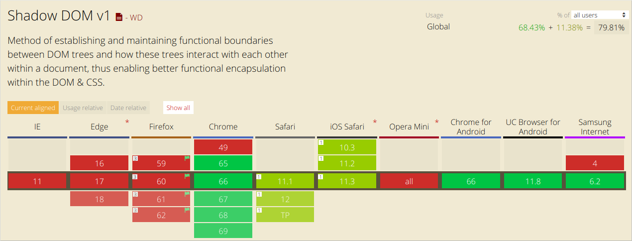
Browser support
To detect whether Shadow DOM is a supported feature, check for the existence of attachShadow:
const supportsShadowDOMV1 = !!HTMLElement.prototype.attachShadow;

In general, the Shadow DOM behaves in quite a different way than the DOM. We have a first-hand example from our experience with the SessionStack library. Our library gets integrated into web apps to collect data such as user events, network data, exceptions, debug messages, DOM changes, and so on, and to send this data to our servers.
After that, we process the collected data in order to enable you to replay issues that happened in your product using SessionStack. The difficulty that arises from using Shadow DOM is the following: we have to monitor every DOM change in order to be able to replay it properly later. We do this by using MutationObserver. The Shadow DOM, however, doesn’t trigger MutationObserver events in the global scope which means that we need to handle those components differently. We see that ever more web apps leverage Shadow DOM these days so it seems the technology has a bright future ahead.
There is a free plan if you’d like to give SessionStack a try.

References:
- https://developer.mozilla.org/en-US/docs/Web/Web_Components/Using_shadow_DOM
- https://developers.google.com/web/fundamentals/web-components/shadowdom
- https://developer.mozilla.org/en-US/docs/Web/Web_Components/Using_templates_and_slots
- https://www.html5rocks.com/en/tutorials/webcomponents/shadowdom-201/#toc-style-host

